Decorating with neutral hues
Finding the perfect neutral hues for your design isn’t always straightforward. As you’ll know if you’ve ever studied a paint color card, with its dozens of nuanced options for white. If you get the combination right, your space will look magically larger and brighter. But if you choose unwisely, it could end up feeling too cold, slightly too warm, or just flat and monotonous.
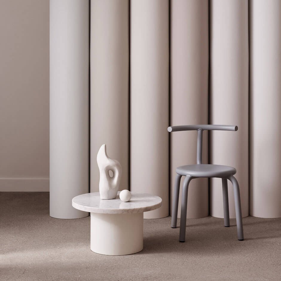
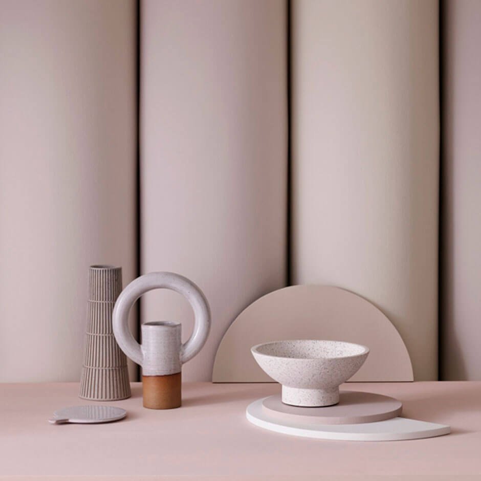
When it comes to decorating neutrals, it helps to think of them not as single shades, but as tonal families. It’s not just about designing a space in one color: layer different variations of the same hue together and you’ll create something with much more depth and interest. The Mylands paints shown here (£46 for 2.5 litres) are a useful case in point, with several paler and stronger neutrals skilfully combined to form palettes that are anything but one-dimensional.
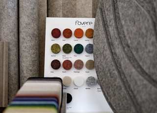
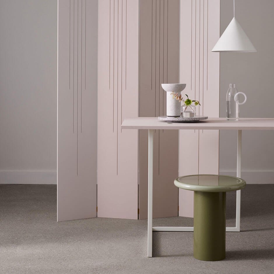
It’s important to remember that neutral doesn’t just mean beige. In these pictures, you’ll notice the shades of pinks, peaches and lilacs, as well as soft greys, putty hues and even the odd hint of blue and green. They can be combined with each other in any way – although often it’s best to stick to either warm or cool shades so they work in harmony.
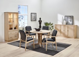
Don’t think of paler shades as boring. It’s possible to have a lot of fun with neutral shades. There are a lot of good reasons to stick with a neutral color scheme for your interior design. In fact, calm, neutral hues allow you to bring out some pretty bold elements into your design that may otherwise look garish.