Japanese cafe imbued with rosy warmth
Fuelled by the growing popularity of nearby resorts, the town of Taki in Japan's Mie prefecture is experiencing incredible growth. A flagship café operated by rice-koji maker Uonuma Jozo is the newest — and arguably the most attractive — new commercial space to join a wave of new shopping malls and high-end stores.
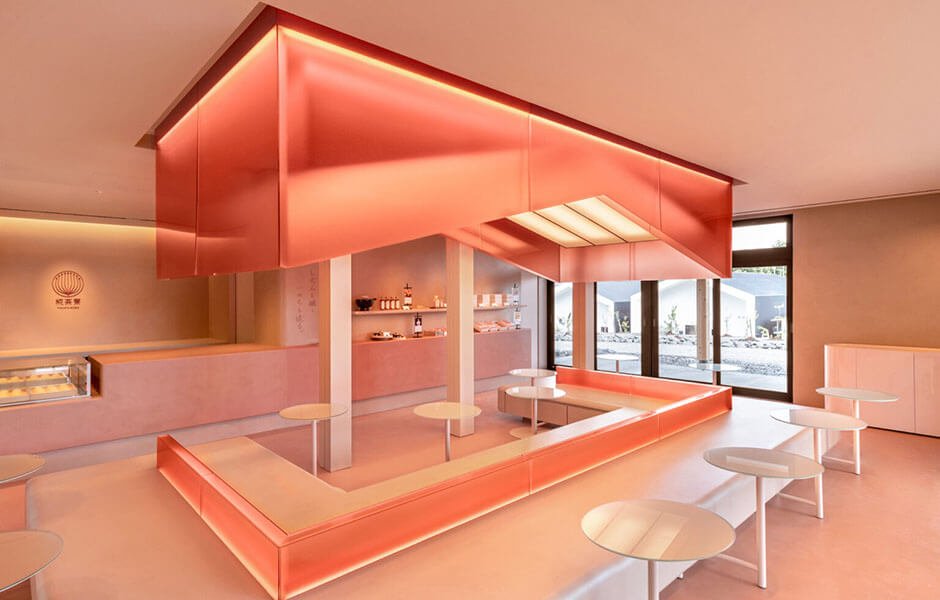
The cafe is designed by Atsushi Suzuki of Transit Branding Studio, with lighting by Mizuki Matsuura, and specializes in Amazake (a sweet fermented rice drink made with koji mold) and other koji products.
The heat created by koji fermentation and the traditional architecture and heavy snowfalls of Uonuma (the company's hometown in northern Japan) influenced the cafe's materials, colors, and shapes. When microorganisms devour organic matter, heat is generated during the koji-making process. The rice itself must be warmed up to a precise temperature for eight hours for a great brew.
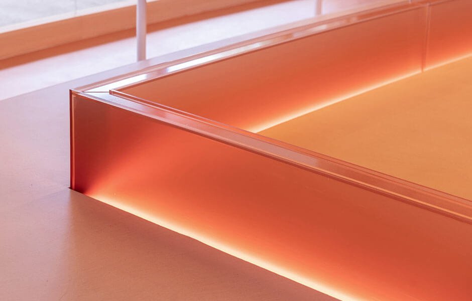
The 70-square-meter area is organized around a central L-shaped bench, reflecting the high foundations of Uonuma's ancient architecture, and foregoes regular cafe tables in favor of tiny, spherical surfaces. The delicate side tables, discreetly affixed to the bottom of the bench, appear to float across the space. A canopy-like light fixture above bathes the room in warm light, simulating the rosy glow of a radiator.
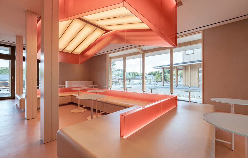
The warm-toned red plaster flooring contributes to the welcoming atmosphere. A counter (made of the same material as the floors) blends in with its surroundings behind the center seating section. Even the tastefully minimalist display shelves sprinkled throughout the walls give subtle variations on the cafe's monotone tones.
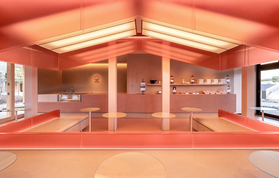
According to the designers, the terracotta-like tone also highlights the "ruddy light that bounces off the cheeks of customers in the café," giving guests a flushed look as if they had spent time in the sweltering heat of an Amazake factory.
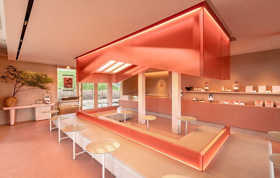
The installation of floor-to-ceiling windows on each wall may be what makes this experiment in uniformity successful without appearing claustrophobic. While the overall sense may be of tremendous warmth, the space is never suffocating. When viewed from the outside, the pink light fixture, which was intentionally lowered to eye level, offers an appealing contrast with the gray facade of the building.


