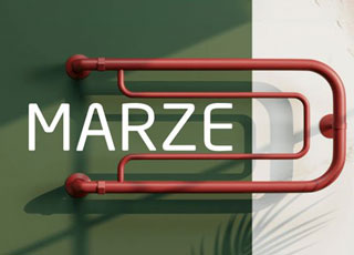
Design Line: a big breakthrough for designers
It is human nature to create something of their own, something unusual, beyond reality but existing in fantasy.
And Design Line is the unusual collection of those creations.
Let us dig deeper into the Design Line project of Deco Line company to discover more about the challenging project.
The mission of the Design Line project is to create new connections with designers and architects and bring to life their newly discovered and creative ideas. With this in mind, Deco Line company embodies the author's unique sketches into reality. Obviously, the authors of the models are designers and architects. And maybe only for this reason, the 3D panels included in Design Line have unrepeatable designs.
Whenever communicating with designers or architects, the company members are under the impression that deep inside designers and architects crave something new, creative, exclusive, and bespoke because they have their ideas. As Deco Line highly appreciates everything innovative, the company came up with the solution of fulfilling the ideas of designers and architects in any way. And here is how the idea of the Design Line project was born. When we say the project, we mean a sort of cooperation between a designer or an architect and Deco Line company.
Design Line is a big breakthrough for designers. The authors give names to their models, which later appear in Deco Line’s catalog. Not only does it give worldwide recognition to the designer but also money: as the designer receives the sale of the model. In other words, the Design Line project allows the designers to represent and why not, sell their model and the company to have a unique collection, and always remain in trend!
Win-Win, right?
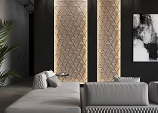
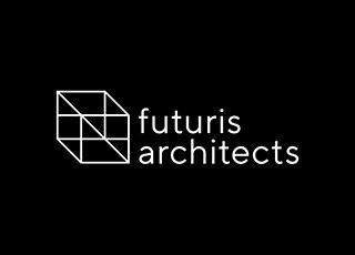
So why not tell about the first but surely not the last success in Design Line? It refers to the first model in this series that was sold! The author of the model is the chief designer of Futuris Architects design studio, Ofelia Vardanyan. She was one of the first designers, much inspired by the idea of having her models in the series. As a result, she has created several models. The first success is all about D-03, a model consisting of tropical leaves but still looking firm and straight like geographical forms. Ofelia says it was a feeling of satisfaction and inspiration when someone from a different corner of the world liked and ordered the model she had created. In general, the feeling inspires designers to go on designing new models.
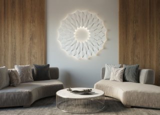
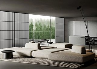
Here is what the director at Imageman Architecture & Interior, Mikayel Karsayn, has done. Up to now, he has already created almost 30 unrepeatable and creative models and named them not less creatively: Dragon Scale, Symphony, Dilong, Arcada, Python, and so on. Below are represented some of the models created by him.